
Analytics Dashboards
The demand side dashboards are located on the demand side of the Platform.
Activity Dashboard (for all types of campaigns)
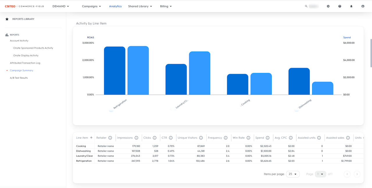
Deep dive into the activity of the campaign(s) running on the account and break down the results by: Campaign and Line Item
Campaign Summary (for Onsite Sponsored Product campaigns)
Get a snapshot of a specific campaign’s performance with high-level data on selected metrics and top performers.
Attributed Transaction Log (for all types of campaigns)
Get detailed insights into which promoted product drove what purchase.

The Activity Dashboard
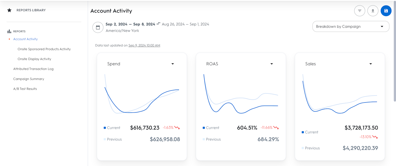
The Activity Dashboard is a deep dive into the activity of the campaign(s).
On demand-side platforms, the Activity Dashboard is located in the Analytics tab in the top navigation bar of the UI. All user roles can access the Analytics section.
It can be broken down by:
Campaign
Line Item.
The Activity Dashboard can also be broken down by campaign type on the left menu bar under Reports. You can select between:
Account Activity (view all data under your account)
Select a specific campaign type.
With this dashboard, you can identify potential optimizations at a deeper level than is possible in the campaign dashboard, and you can observe if your changes resulted in improvements.

Interactive Graph and Data Table
Interactive Graph
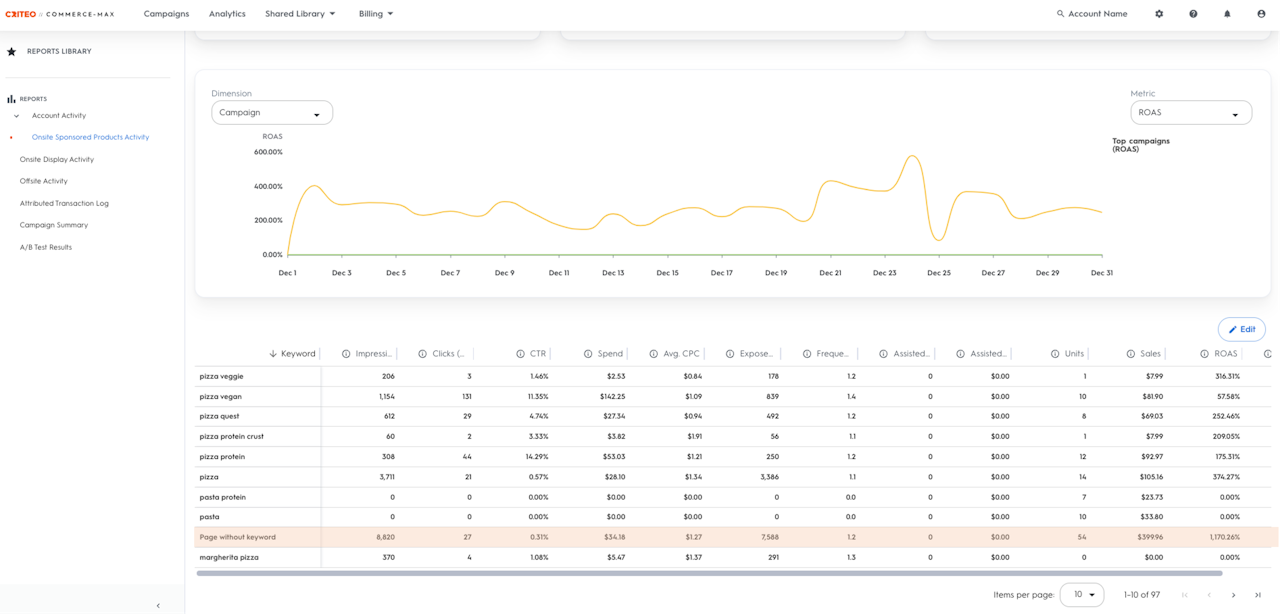
This graph shows the top eight performers based on the metric that can be selected on the right in the graph dropdown. Choose the time range for data visualization by clicking the calendar icon on the top left-hand side, just above the graph.
The campaign dashboard tooltip shows the data of the selected metric for a specific date. Simply move the cursor in the graph to the date interested in to see in more detail.
Data Table
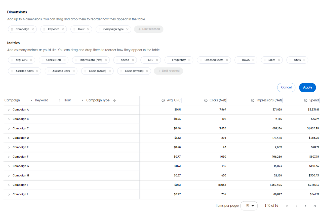
Below the graph, there is a detailed table with all available metrics. The table will be populated based on the breakdown selected in the breakdown drop-down above the graph.
For more information on product and placement impressions, visit our Demand-Side Metrics article.
Sort the metrics by clicking on their name in the table header and expanding the data to show all dates by clicking on the entity name in the first column.
Page without Keyword
There is a new metric that is included in the Sponsored Products Activity Dashboard called Page without keyword.
This metric will appear as a row in the Data Table below the graph when Keyword is selected as a dimension. This metric is the combination of all other page types (PDP, Homepage, Category, etc.) except the search page, as there are no keywords used when sponsored products are served on non-search page types.
The reason for this page without the keyword line is to ensure that the data matches across all dimensions within the Data Table when customizing report.

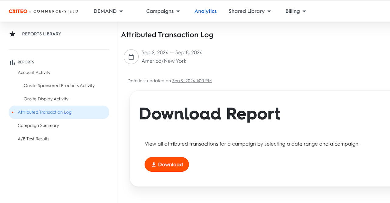
Attributed Transaction Log
The Attributed Transaction Log (ATL) report provides a large data set for additional insights on products that were purchased and attributed to the ads.
The ATL allows seeing every attributed transaction for a campaign. This report can be used to compare the time the ad displayed with the time the purchase was made and the product that was advertised with the product that was purchased.
Users can select 1 or many campaigns using the dropdown selector in the top right. After selecting your campaigns, select the date range to pull data for, and then press the download button. All data for all selected campaigns will then be pulled into one excel (or .csv) file for you to download.

Campaign Summary
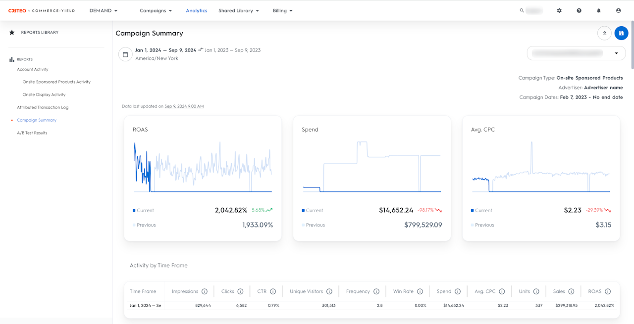
The campaign summary report gives an overview of a specific campaign’s performance.
It includes a summary of:
Main campaign metrics
Fully interactive charts with customizable metrics
Overview of the top performers (top product categories, top SKUs, top page types)
At the top of the report, four key metrics represent the overall campaign trends over time. Select the metrics of your choice.
Below that, a bar and dot chart allows a comparison of Spend and ROAS performances from multiple angles at once, including Top 5 Product Categories, Top 10 Products, and Top 5 Page Types.
Finally, several sections represent top performers. For more details, click Go to dashboard and access more granular data in the Activity Dashboard.
Since this report only works for one campaign at a time, use the drop-down menu on the top right corner of the page to choose another campaign to display.


